Dark mode is not
the inverse of light
The same interface needs a different
balance after dark.
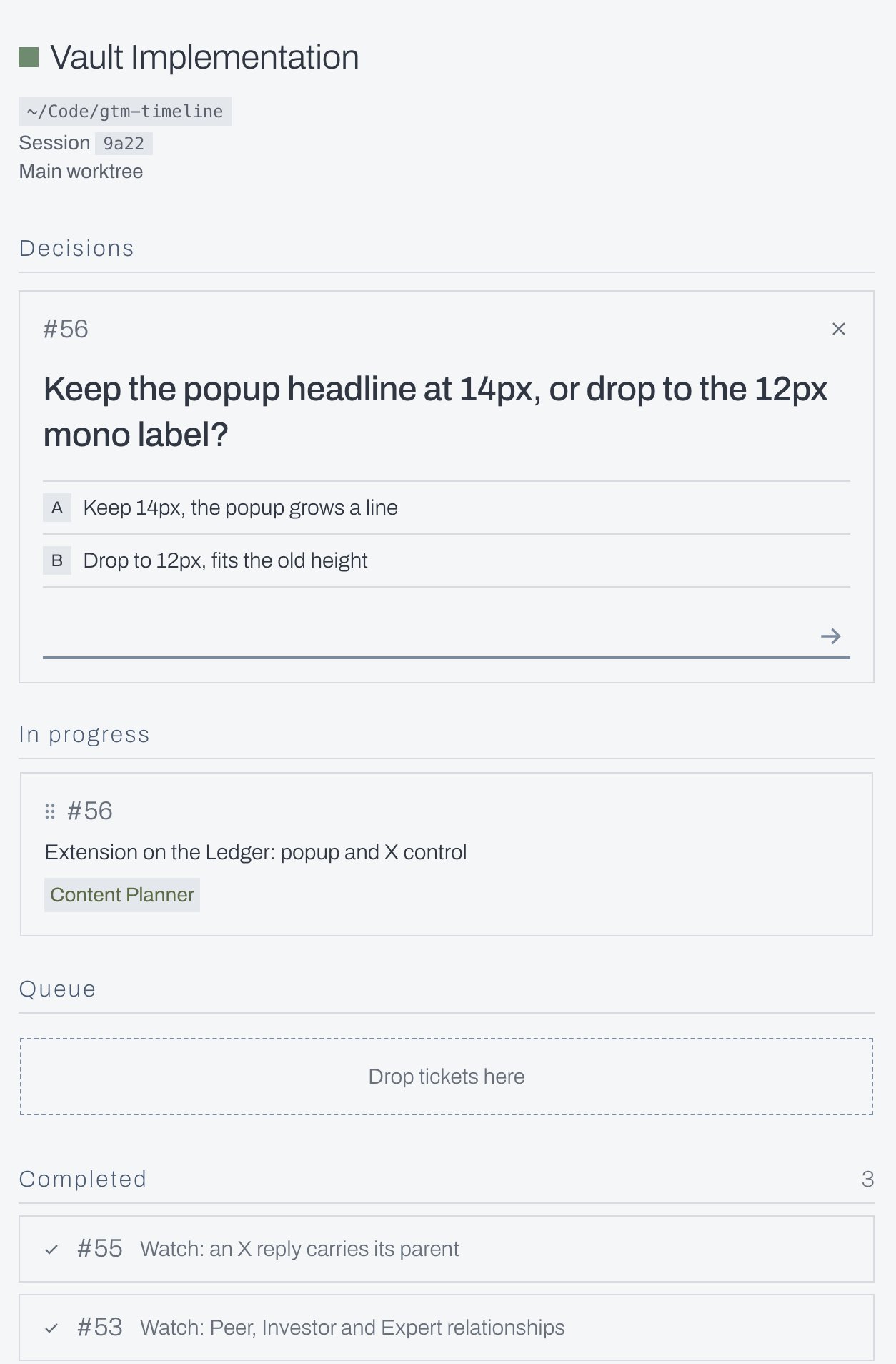
Dark mode is not just the inverse of light mode. Here are three versions of the same screen to show why: the original light version, a direct dark version, and a tweaked dark version.
Light mode feels a bit more forgiving. Even a font weight that works well on a light background can feel heavy on your eyes when you move it into dark mode. The values may be the same, but the screen feels different.
A quieter dark version
The headline was one of the clearest differences. In the refined version, a lighter weight gave the decision room to breathe. It still stood out without feeling quite so heavy.
Lines and borders were adding noise too. I reduced the separators inside the decision card and removed the dashed outline around the empty queue. The structure was still there, with less competing for attention.
This was a quick experiment. The useful question is how the whole screen reads after the switch: the weight of the text, the strength of the boundaries, and what catches your attention first.